The Wild, Wild West of Accessible Social Media: Part Two-
Ever wonder what Chris’ process is for sharing content on his website, blog, newsletter and social platforms? Well, I am Sydney Naseef, and I am honored to play a role in helping Chris disseminate his stories, learnings and experiences by working as a freelancer for Knapp Strategic and Accessiversity Labs. I’ve been working with Chris for almost a year (all of which has been entirely virtual), and while it has been rewarding in the traditional sense of gaining more professional experience, it’s important to note just how much I’ve learned as a result of this collaboration with Chris, and how my attitude toward the importance of web and social accessibility has drastically shifted as a result – which is the essence of this two-part blog.
In part one of this two-part blog series (which I recommend you go check out to hear more about how Chris and I met, and to hear me brag about how great Accessiversity Labs is!), I shared more about myself, the work I do for Chris and what I’ve learned about accessibility and inclusivity in the digital space as a result of our partnership. If you did give part one a read, you’ll remember that I alluded briefly to just how easy it is to update your own online spaces and social platforms to be more accessible. And if you’re dedicated to following Chris’ lead and leaving your print on a more accessible world, you’re probably thinking, “So, where do I start?”
So, the key focus for part two? How to apply these best practices, specifically on social media, so as not to exclude a major audience from viewing your content. This blog will simply discuss key things that you should start to implement on your social media channels. When it comes to social media, or as Chris calls it, “the wild west of the digital space,” there is an infinite number of things you need to consider as you work to engage with your viewers and build a real following. Accessibility is, indeed, another critical thing to add to this list, and this blog is meant to serve as a starting point for shifting your profiles and pages into a more accessible social space.
As I mentioned in part one, I did come into this role with prior knowledge of the digital space thanks to past internships and roles. Because of this, I have consistently been taught those everyday, well-known rules about successful social media tactics; tactics like “keep your content short and punchy so as not to lose your readers’ attention” and “use words that will motivate your audience to engage or inspire an action”.
What I did not learn, or more accurately, what simply wasn’t top of mind, was making social copy and images completely accessible to blind and/or low-vision users. While I recall the importance of “alt text” being mentioned in passing, it simply never occurred to me how ignoring such a simple task would entirely alter someone like Chris’ view of an online page or a social media post. Now, I look back at captions or posts I’ve written, and realize that if I were unable to physically see the visual attached to the post, in many cases, I would have no idea what the copy was referencing. And just like that, I was inadvertently hindering a vast number of individuals from seeing or hearing what was, at times, very important or useful information.
Now, working with Chris regularly on his social media content, I have learned a number of great, easy accessibility tips and tricks that you can begin to utilize on your own personal or business platforms. I did some research to find the best guides and toolkits out there so that I can make this a one-stop-shop beginners guide on social media accessibility, with links to more in-depth toolkits and manuals. If you’re looking for an easy place to start, look no further! You’ve come to the right blog.
Below, I will share what I believe are the four general, essential guidelines of accessibility applicable to all of the major social platforms: Facebook, Twitter, Instagram and YouTube. I hope that as you read on, you begin to reassess your posting process, and you start to put these things at the forefront, right up there with the rest of those “best-in-class” social media pointers.
And, just a reminder, that yes – I’m only 22, and I’ve only been working in the world of online accessibility for less than a year. I still have much to learn about accessibility (and I’m certain the learning won’t stop any time soon!), and I still have a number of bad habits I need to break to ensure I am producing inclusive content – not only on Accessiversity Labs’ channels, but my own. Looking at my personal Facebook page, I am pretty quickly able to point out a number of posts and places where I neglected to add alternative text or properly caption a post, not because I don’t care, but because as a sighted individual, it is all too easy for me to assume those viewing my post are just like me, and can understand the post without additional context.
Well, now that Chris is one of my Facebook friends, there’s my daily reminder to take those two extra seconds to add some alt text! So, feel free to friend request Chris if you need someone to hold you accountable. I’m sure he will appreciate me saying that.
The Accessibility Essentials For Social Media
1. Use Accessible Text
Just as we are told to keep text short, concise and simple as a general rule of thumb for writing social media content, the same applies when it comes to improving accessibility on social channels.
The fact is, while screen readers do their best to relay information, they are still machines. It’s important that you write in plain, easy-to-read text and use simple fonts to ensure your message is not improperly communicated to the user.
For example, when creating hashtags on social media, it is advised that you capitalize the letters of each new word, also known as CamelCase. John Gibbons, a digital accessibility and sustainability consultant from the United Kingdom, shared on Twitter that when writing the hashtag for “Black Lives Matter”, it should appear as #BlackLivesMatter versus #blacklivesmatter. Why? Because screen reader software will pronounce the latter as, “black live (the verb) smatter”. A simple matter of sentence case can completely alter the meaning of your post. When I shared the draft of this blog with Chris, he informed me that his JAWS screen reader did in fact pronounce the lowercase hashtag incorrectly, and the CamelCase hashtag properly. Not making this up, people!
It is these seemingly miniscule things that can make or break a blind or low-vision users’ experience on your social channels. So before you hit “post” or “publish”, read it over with this in mind.
2. Alt Text, Alt Text, Alt Text
In our increasingly visual world, I would argue this is perhaps the most important and relevant step for making social platforms accessible and inclusive. Not only that, but alt text also contributes to stronger SEO, meaning it helps search engines return results, ultimately ranking your website or platform higher, leading to more viewers and visitors. No matter which way you slice it, this easy extra step only leads to an improved social media presence.
How often do you find yourself sharing an image with a cryptic caption like, “Love this photo!” or “This is great!”. If you’re anything like me, embarrassingly, the answer is A LOT. I do love my memes. While platforms do their best to automatically generate alternative text, we all know machines get it wrong. So, imagine being a blind or low-vision user who’s screen reader is relaying this content. All they hear is, “Love this photo!” and then some kind of gobbledygook attempt at making sense of the image that you’re sharing with your followers. That attempt tends to read something like, “Image may include: Tree, grass, leaves.” That certainly doesn’t paint an accurate picture in my mind.
Below, find step-by-step instructions for how to add alt text to your images on Facebook and Twitter, and general best practices for writing stellar alternative text.
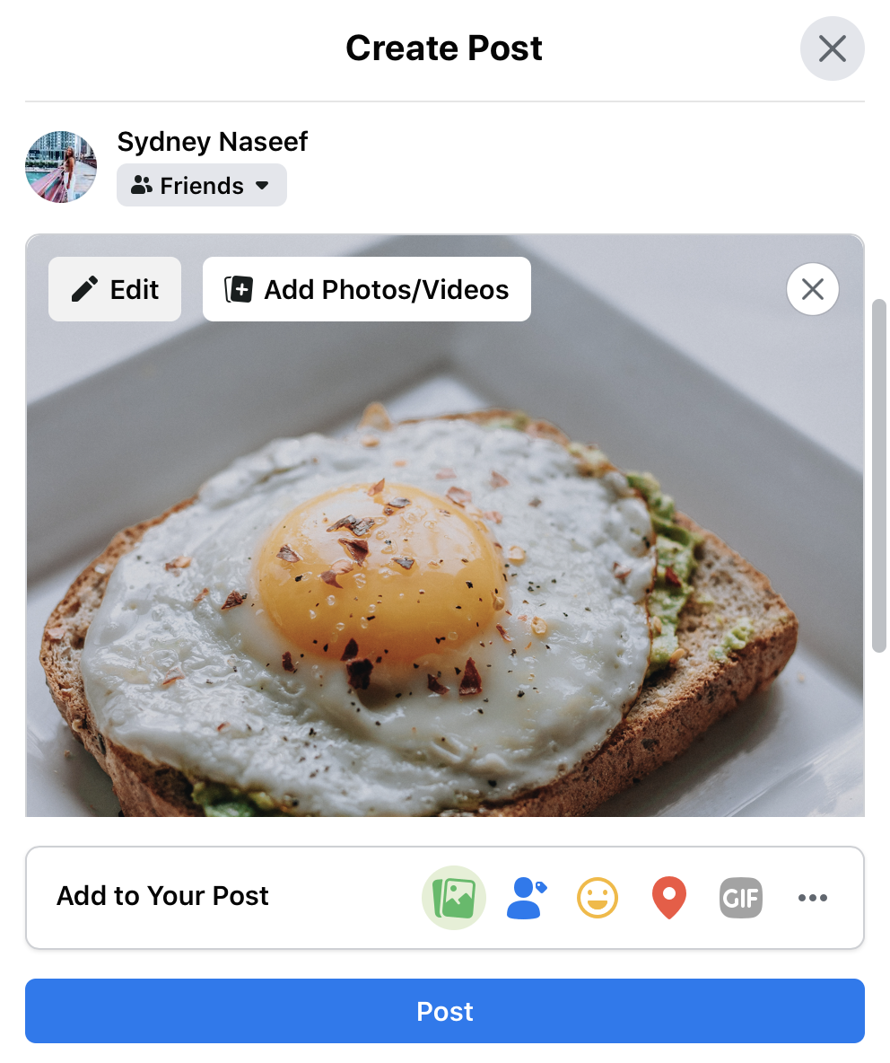
Here’s how to do it on Facebook:
When uploading your photo, click the “edit” option in the top left-hand corner of the image
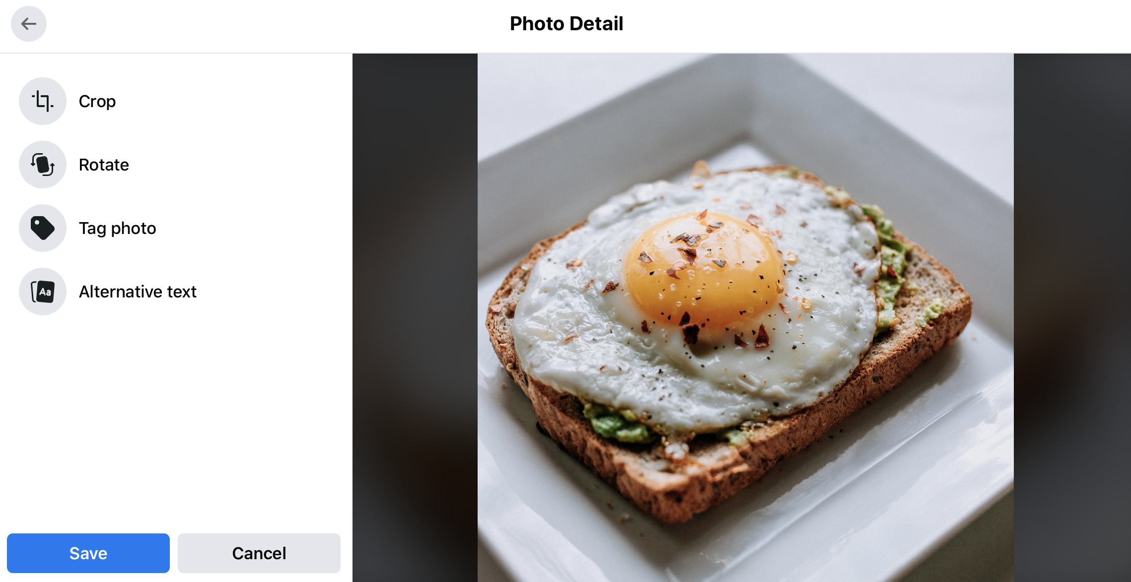
You will be prompted with a new screen, where you can choose the “alternative text” option
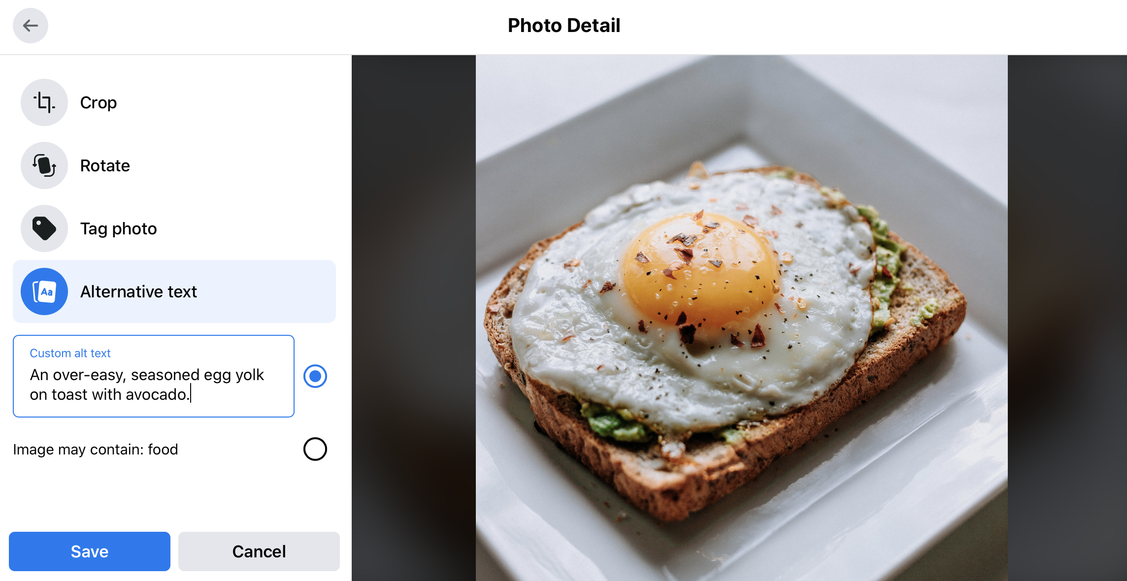
Add your alternative text
Click through the images below to see a visual step-by-step.
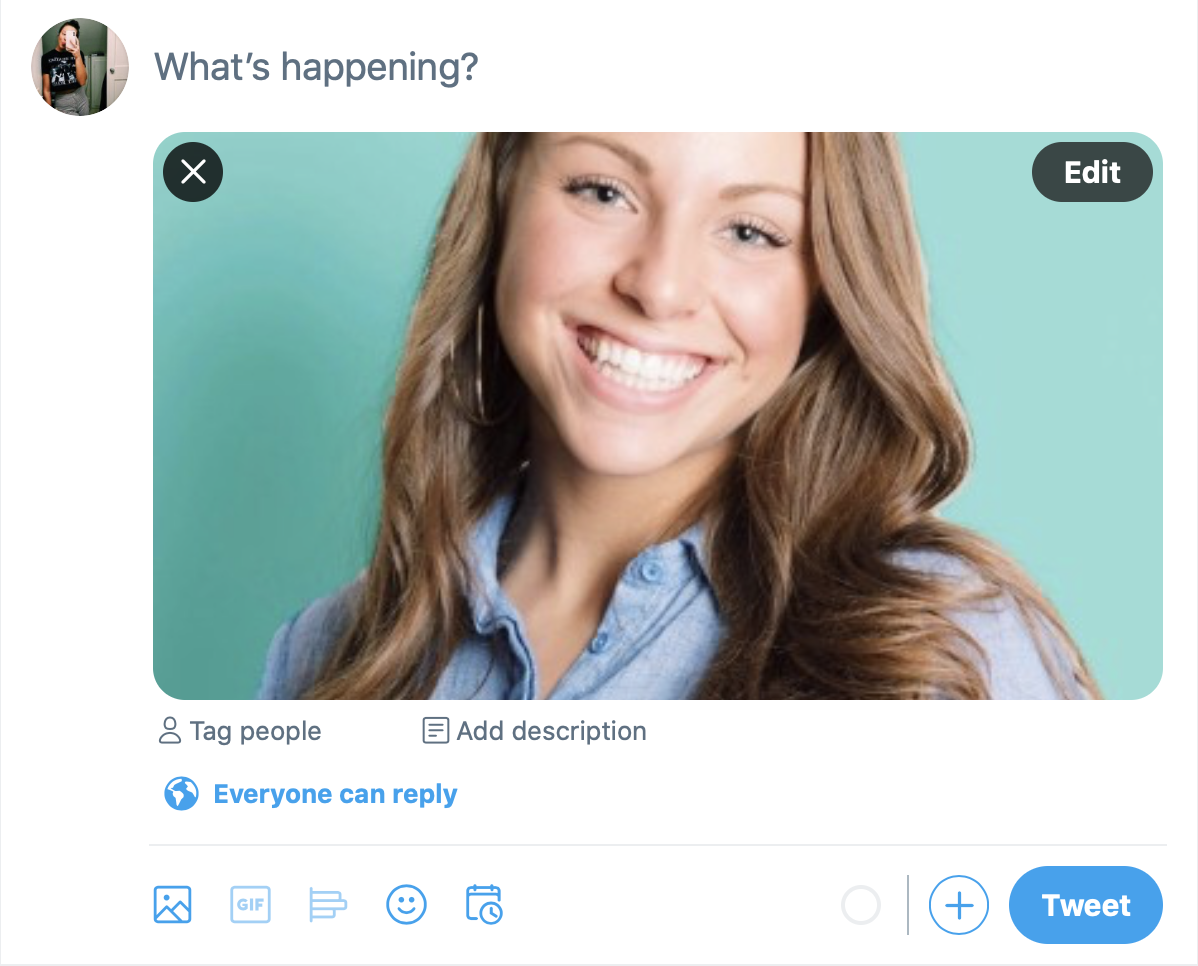
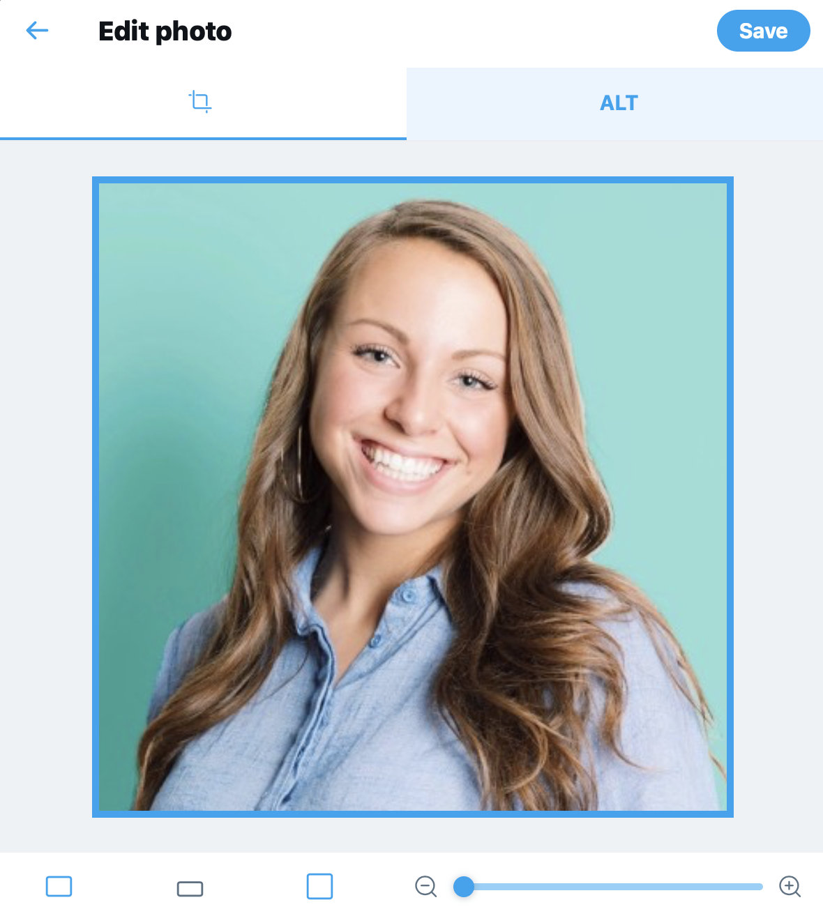
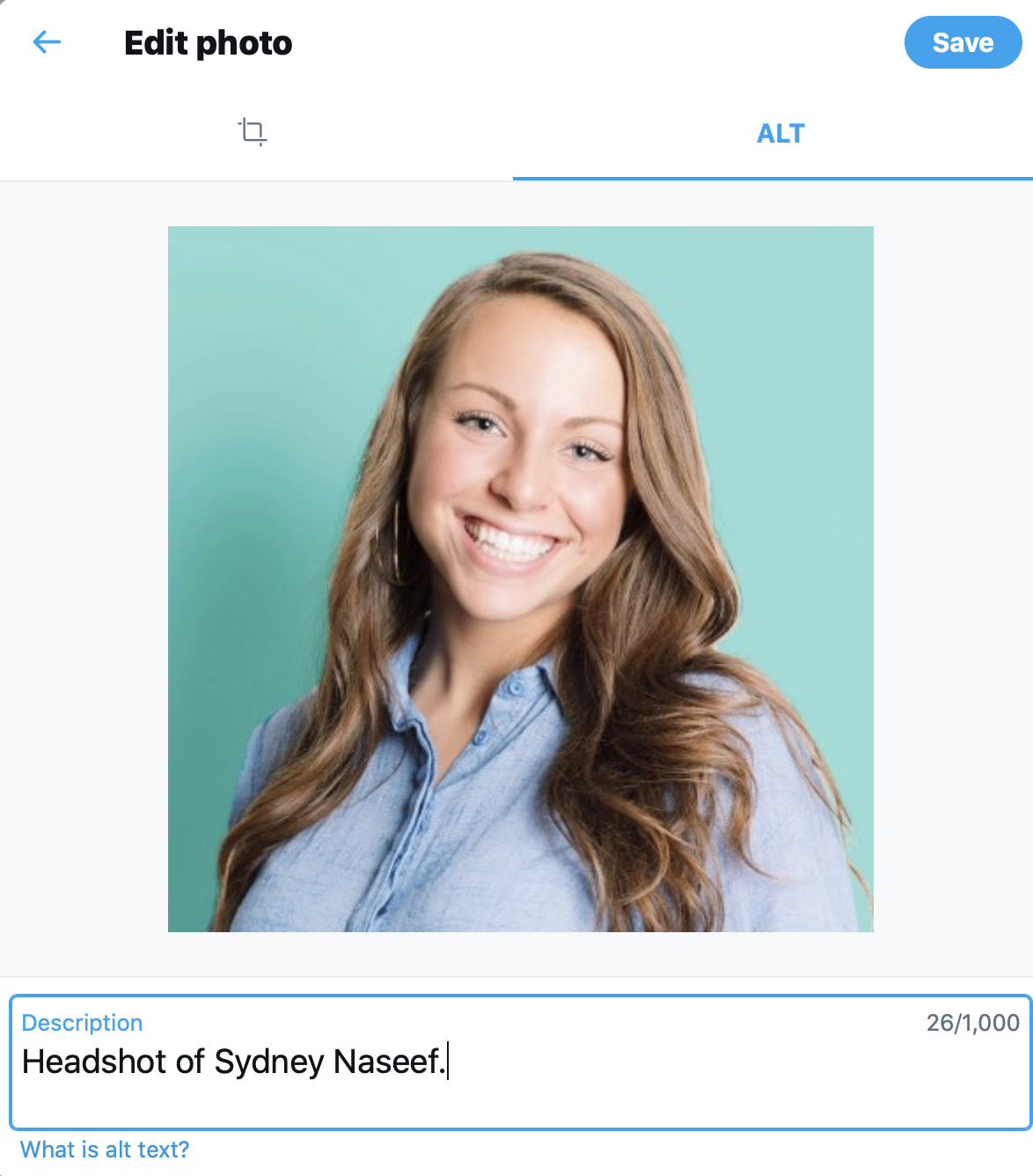
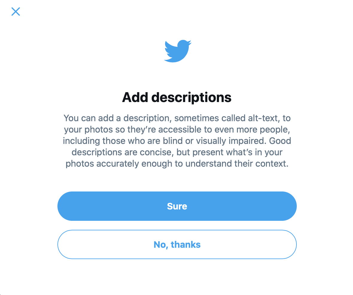
Here’s how to do it on Twitter:
When uploading your photo, click the “edit” option in the top right-hand corner of the image
You will be prompted with a new screen giving you the option to crop your image (on the left) or add “alt” text (on the right)
Add your alternative text in the “description” box
Click through the images below to see a visual step-by-step.
General tips for writing great alt text:
Keep it short, but make it detailed. For example, if I am uploading the photo in the Facebook step-by-step example, I would not write, “Egg on toast”. I would write, “An over-easy, seasoned egg yolk on toast with avocado”. We want the individual to really be able to imagine the visual in their heads, since they can’t physically see it.
Do not write “this is an image of,” or “here is a photo of”. Simply write exactly what is being shown in the picture. The screen reader of blind and low-vision users will inform the viewer that this is an image. To include that initial text will simply come off as repetitive.
Context is important. While it is not recommended to introduce alt text as, “this is an image of,” it is helpful to discern what kind of image is being presented, whether that be a headshot, an illustration, a chart, etc.
That said, some social channels (such as Instagram) do not yet have an option to include alternative text. In such cases, captioning becomes all the more important. When you are unable to provide alternative text due to the nature of the channel, this means your captions need to properly describe what is being depicted in the corresponding image. I know this may not always be a priority for your personal channels with a smaller circle of viewers, but if you are marketing a business or product on Instagram, it is vital that you provide descriptive captions to reach a broader audience. For example, if you’re sharing a quote or fact in the form of an image on Instagram, you should list that same quote or fact in the caption. Simple as that!
3. Video Captions Are A Must
While most platforms do implement auto-generated captions (minus Twitter, but don’t worry, that’s coming soon!), you can also transcribe the video captions yourself or upload a supported file.
Not only do video captions improve accessibility, but they also improve overall user engagement. In a Hootsuite blog titled, “Tips for Creating Accessible Channels”, it was revealed that Facebook has performed internal tests, ultimately proving that videos with captions resulted in an average 12% increase in view time. According to Automatic Sync Technologies, a company that provides closed captioning services, captioning also improves indexing and searching for SEO purposes. If that weren’t enough, you’re able to reach people on the go. Whether they are in a noisy arena or a quiet library, they can view your videos simply by reading the captions.
I’ve learned from Chris just how important video captioning and transcripts are. When we share his videos/interviews on social media, we always make it a priority to have the video transcript uploaded on the website. This way, we can link back to the transcript so users are able to view the full written transcript online. It is an extra step, but it’s an important one.
4. Stay Up-To-Date On Emerging Accessibility Tactics And Tools
Hootsuite put together a great list of platform pages and links dedicated to sharing updates in the accessibility world. We all know the digital world is constantly shifting, and the world of online accessibility is shifting with it. If you are looking to keep abreast of accessibility trends in the social media landscape (which I hope you are!), please view the links below to stay informed.
Facebook:
Twitter:
Twitter Accessibility account
Twitter Able account
Twitter Together account
Twitter Safety account
Share feedback on accessibility and other issues
YouTube:
YouTube accessibility settings
YouTube support
Pinterest:
LinkedIn:
Ultimately, I think one of the more important things to keep in mind as you navigate the complex and continually evolving world of social media is to simply keep an open mind. When someone in your life with a visual disability (for me, that’s Chris) shares a new article on accessibility, read it. When they mention in passing that they had an issue reading or comprehending something that you shared via their assistive technology, ensure you fully acknowledge and understand the crux of the issue so you can make the necessary updates.
It is all too easy for those of us who share or manage social media profiles and pages to operate our channels with the topic of accessibility in the back of our minds. But it’s time to move accessibility to the forefront. And it is with these small tips and tricks that you can truly leave your print on a more accessible world, by shifting your social channels to present a more inclusive space.
For more in-depth guidelines and processes on accessibility in the social media space, check out the links below.
Hootsuite – Inclusive Design for Social Media: Tips for Creating Accessible Channels
Digital.Gov – Federal Social Media Accessibility Toolkit Hackpad
Princeton University – Social Media Accessibility Guidelines
Click to go back and read part one!
__________________________________________________________________________________________________________________________________________
About the Author:
Sydney Naseef is a senior associate on the Spark Foundry business development team in Chicago. At this award-winning global advertising agency, she works alongside a talented team in building the agency brand, crafting and submitting RFI’s/RFP’s and developing pitch presentations in an effort to win new business. Sydney graduated with high honors from Michigan State University in 2020 with a Bachelor of Arts Degree in journalism and a minor in public relations. She excels in written and digital communications, content creation, strategic storytelling and design…and slowly but surely, online accessibility!
Check out her online portfolio: https://www.sydneynaseef.com


